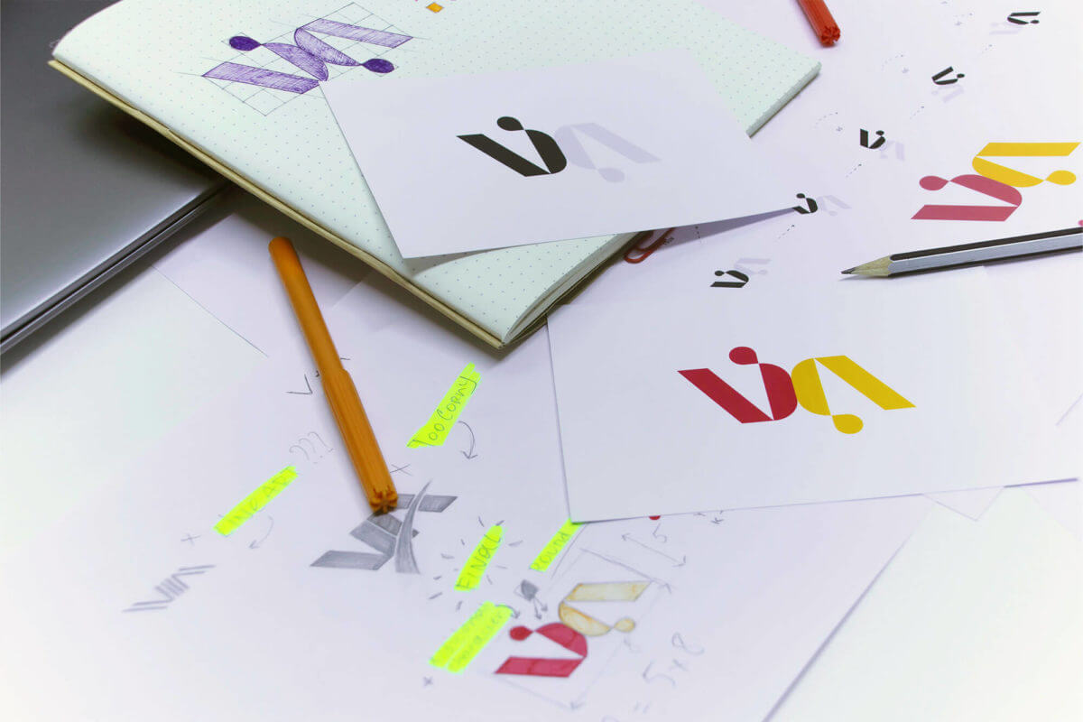
The logo’s function is communication with customers. It communicates as much information as possible about the company’s identity. It is designed to make the company stand out from competitors, to build loyalty with existing customers and to appeal to new ones. These graphics may look simple, but they’re very powerful.
The secret to the logo’s power lies in its ability to be aesthetically pleasing, with all aspects of it, including colors, shapes and letters, being there for a reason.
Top Logo Design Trends For 2022
Designers are living in very exciting these days. Everyday innovation is happening, there are many trends and endless possibilities. There are so many options that inspire and it is hard to not be inspired by them all.
Logo design must be dynamic to keep up with social and current trends. Recent rebranding cases are a good example of this adaptability. Many logotypes have been changed or modified by companies like M&M, Pfizer and even the Coca cola. Because the digital media environment has changed, old logo designs were no longer appropriate. To be compatible with the modern development in digital communication and web design, simplifications were needed. While smaller pixels can speed up loading times, the details of small files are often lost.
Before we get into the top graphic design trends for 2022, let’s just say that the overarching trend is:
-
Simplicity,
-
Limited color range (growing preference for blue, white, gray and gray colors)
-
Flatness
-
Adaptability
Most likely, they will continue for the next year.
Minimalism: Less is More

Minimalism’s fundamental rule is to be minimalist but still striking. In the future, logos must communicate more with fewer elements. People don’t have the time or patience to deal with ambiguities in a digitally noisy environment. People’s attention is scattered and it is important to convey a clear message in a neat and clean design.
A minimalist logo can be very effective if done correctly. There is one thing to be aware of. Minimalism doesn’t mean a lack of design elements. This only makes a logotype seem sluggish. Minimalism is about removing excess so that you can see the essentials.
Many minimalist logos exist, but the most memorable ones are Apple’s bite-sized fruit silhouette, Nike and FedEx.
Asymmetrical/Chaotic
 This trend is against minimalism, which has dominated art for many decades.
Logos that are inspired by asymmetry will appeal to those who seek a little bit of playfulness in their world. This trend gives designers more freedom to experiment with elements and their combinations.
As is often the case, the greatest risk is in the greatest strength. A unique logotype is likely to attract attention and impress the audience. It is important to balance the eccentricity. People might be confused, or even frustrated by the hazy design.
The story behind Starbucks’ logo is very interesting. In 2011, the company updated the logo and it is now the graceful sirene we see when we wake up. Bogdan Geana, who was part of the design team that created the Starbucks logo, explained the secrets to this seemingly symmetrical design.
“In the end, just for the face part of the drawing, there’s a slight asymmetry to it. It has a bit more shadow on the right side of the face. It felt a bit more human, and felt less like a perfectly cut mask.”
Geana and his team will never know where the inspiration came from, or if it was in the dark bags under our eyes when they are desperately in need of coffee Monday mornings. Whatever the case may be, this example illustrates how powerful asymmetry can prove to be when used correctly.
While other trends focused on the order and number of elements, the gradient trend is all about the colors. The gradient logotypes are vibrant and vivid. They will continue to be popular with designers.
This trend of gradients is especially relevant when we consider the global rebranding trends mentioned at the start of this article. This is because it allows for great logo modifications by combining solid colors in subtle shades. This applies regardless of whether the color play is a major modification or a subtle supporting one.
Avoiding too much color thickness can lead to dim and indistinct logotypes. The conical gradient should always be accompanied with depth, shadow, 3D and shadow effects.
Firefox’s gradient logo is perhaps the most famous. Their long-term logo features a burning fox wrapped around the globe. It was greatly stylized in 2019. The colors are now less saturated and more gradient-based.
Flat or Semi-Flat
 A flat logotype design trend began to gain popularity around a decade ago. It became almost a norm. These logos were a big hit with online communities. Some memes were even created to express dissatisfaction with these logotype solutions that lack character.
As we all know, trends are often reintroduced with a fresh look. This is what will happen with the flat trend for 2022.
Shadows behind flat logos make a subtle but significant difference. Google’s Gmail logo is simple and bright. This is a great example of flat logo design that is particularly relevant to new businesses. This modern design is a powerful message. It’s easy to adapt to different platforms, and it provides a clear hierarchy of visuals. This leaves space for important details. It also shows that the brand is in tune with current fashion trends and modern tastes.
Eye-Tricking
 Similar to the trend for asymmetry, this logo aims to stimulate curiosity. The logo tricks the viewer’s perception in this instance. The designer shows things that appear to defy logic and the laws of nature.
You can achieve this by using a variety of techniques, including creating surreal imagery, hiding shapes, playing with depth, distortion, and negative space.
Depth games were very engaging and entertaining, and they will continue to be popular. It is important to stress that this shouldn’t be too much. Making design too demanding can reduce interest. This type of logotype is best illustrated by Toblerone. While most of us can see the mountain that is above the red inscription of a brand’s name, did you ever notice the bear? It’s possible to conceal something so that people can remember what it was. Toblerone told us their chocolate is from Switzerland, but secretly reminded us that it comes from Bern, a city that bears are associated with.
Geometrics
 Geometric logotypes are simple and symmetrical graphics that reduce all forms to basic shapes (squares circles triangles). AirBnb is the owner of many of the most well-known geometrical logos, as well as many cryptocurrencies like Ethereum and Binance Coin.
This type of logo design has many connotations. They are suitable for brands that seek futuristic, serious and mathematical meanings and values. This design solution has the greatest benefit of elegance and seriousness.
Each of these basic shapes also has a meaning. A triangle with an upward arrow signifies masculinity and a triangle with a downward arrow connotes femininity. Businesses that care about community values and care will have a circular logo. A squared design demonstrates professionalism and endurance. Monotony is the biggest danger with this design. While there are many brands, there is only a small number of basic shapes. It might be worth trying out less-popular basic shapes like diamonds, hexagons, and ovals.Mitsubishi’s logo, for example, has three lozenges that join at one spot. This is a reference to Iwasaki Yataro, the founder of the company.
Mobile, Animated
 This trend is quite new and was created as an alternative to simplifying logos. Although it doesn’t usually make logos more complex, it can add an animated effect to existing logos.
Because of their ability to surprise the eye and attract attention, motion graphics are rapidly gaining popularity.
Animation is a powerful tool for brands to break up the monotony and draw attention. Netflix’s animated logo is easily recognizable. This type of logotype should be carefully designed. This is where the art lies in adjusting the speed to suit your needs. It should not be too fast or too slow. An animated logo may not be the best choice for your primary logo, as animations don’t work on every platform. However, it is a great choice for the secondary logo that can be used on website presentations and at the beginning of Instagram videos.
Detailed and naturalistic
This trend will not be stopped, regardless of minimalistic dominance. Designers and companies will continue to be open to seeing vivid images and animations rather than simple symbols. All shades, textures, colors, and details are allowed. Anything except for negative spaces. It can be difficult to create a naturalistic logo, no matter how interesting. Because too many details can be difficult to see on small screens, and they transmit easily across many platforms. However, it is possible but not recommended for the bravest.
Because there aren’t many examples of logos that are extremely detailed, it can be difficult to find them. Dogecoin’s logo features a photo of a meme dog in a circle that resembles a coin. The letter D is usually written above the image.
Last Thoughts
The future will see the continued development of social media technology and how brands communicate with their audience. At WorldPlay Digital everything from the logotype design to the whole process of building brands, website design, principles and content marketing, are created to be more effective, flexible, assertive, and impactful.
This realization is reflected in many famous brands who begin to change their logotypes to reflect the new communication methods. It is always a good idea for new brands to learn from the greats.
Contact us and find out how we can help your brand stand out.


